Aista
A B2B company that specializes in AI solutions. Offering customizable chatbots, ChatGPT, & more.
Services:
UX/UI Design
Web Design


Challenge
The team faced the challenge of creating a section to help clients manage and craft chatbot solutions on their websites.
Project Duration
14-Months
Team
1 - Developer
1 - Project Manager
1 - Design Lead
5 - UX/UI Designers
Process
Discovery
Ideation
Design
Developer Handoff
Tools
Figma
Figjam
Zoom
Slack
Illustrator
Photoshop
Solution
We created user stories aligned with the client's site map to match their requirements with our solutions. Each team member was assigned specific user stories, allowing us to efficiently divide and conquer the task. We developed flows for both automated and manual chatbot setups. My role was to design the chatbot dashboard, manual setup page, and initial setup page for chatbots.


1
Discovery
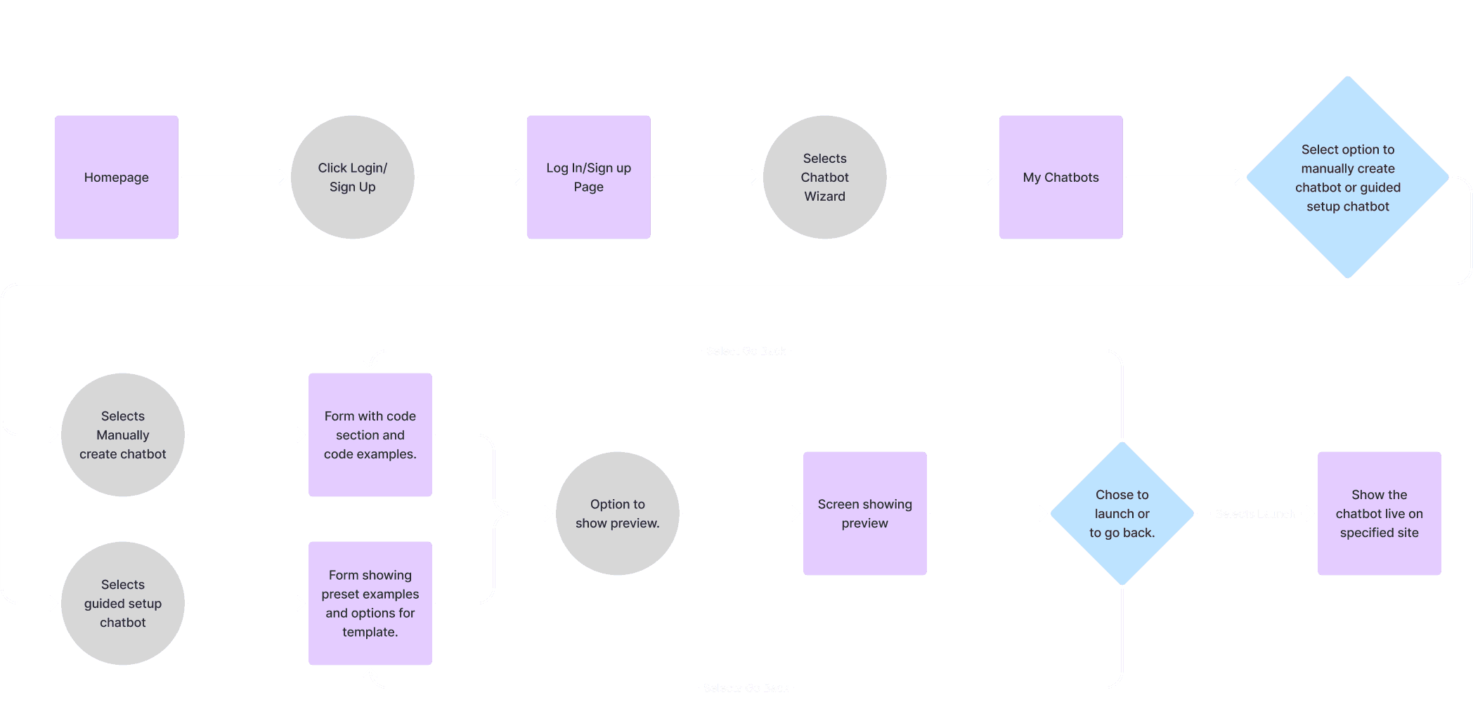
We conducted a comprehensive review of all the materials provided by our client, including site maps, Figma files, and their existing website.
A key focus of our meeting was the meticulous examination of the user flow/site map the client presented to us. This analysis served as the foundation for our subsequent steps, as we systematically broke down the newly identified branches from the site map into individual user stories, setting the stage for a structured and well-coordinated project execution.
2
Ideation
User Stories
Based on the site map/user flow that the client provided, each team member was given a user story to execute. Each statement was carefully crafted to fit the needs shown on the map. As the team member with some HTML/CSS background, I volunteered to do user story #3 because there was some coding knowledge involved.
1 As a user, I would like to register with the site successfully.
2 As a user, I would like to add a new chatbot using a wizard.
3 As a user, I would like to
add a new chatbot manually.
4 As a user, I would like to view the chat history and edit responses to refine it.
5 As a user, I would like to view the chat history and edit responses to refine it.
User Flows
We combed over the flows as a team and with our team lead before we submitted them to the client. There were several flows that were very similar especially the manual setup and automated setup chatbot flows. I had to make adjustments due to some of my content overlapping with the automated ‘Chatbot Wizard’ version. As you can see to the right my adjustments.
Version 1
Version 2


UI Inspiration
As a team, we conducted thorough research across various developmental aspects. The snippet on the left highlights our findings. Our focus primarily revolved around industry standards, contemporary design trends, and the methodologies employed in crafting chatbots and dashboards.
Mid-Fi Wireframes
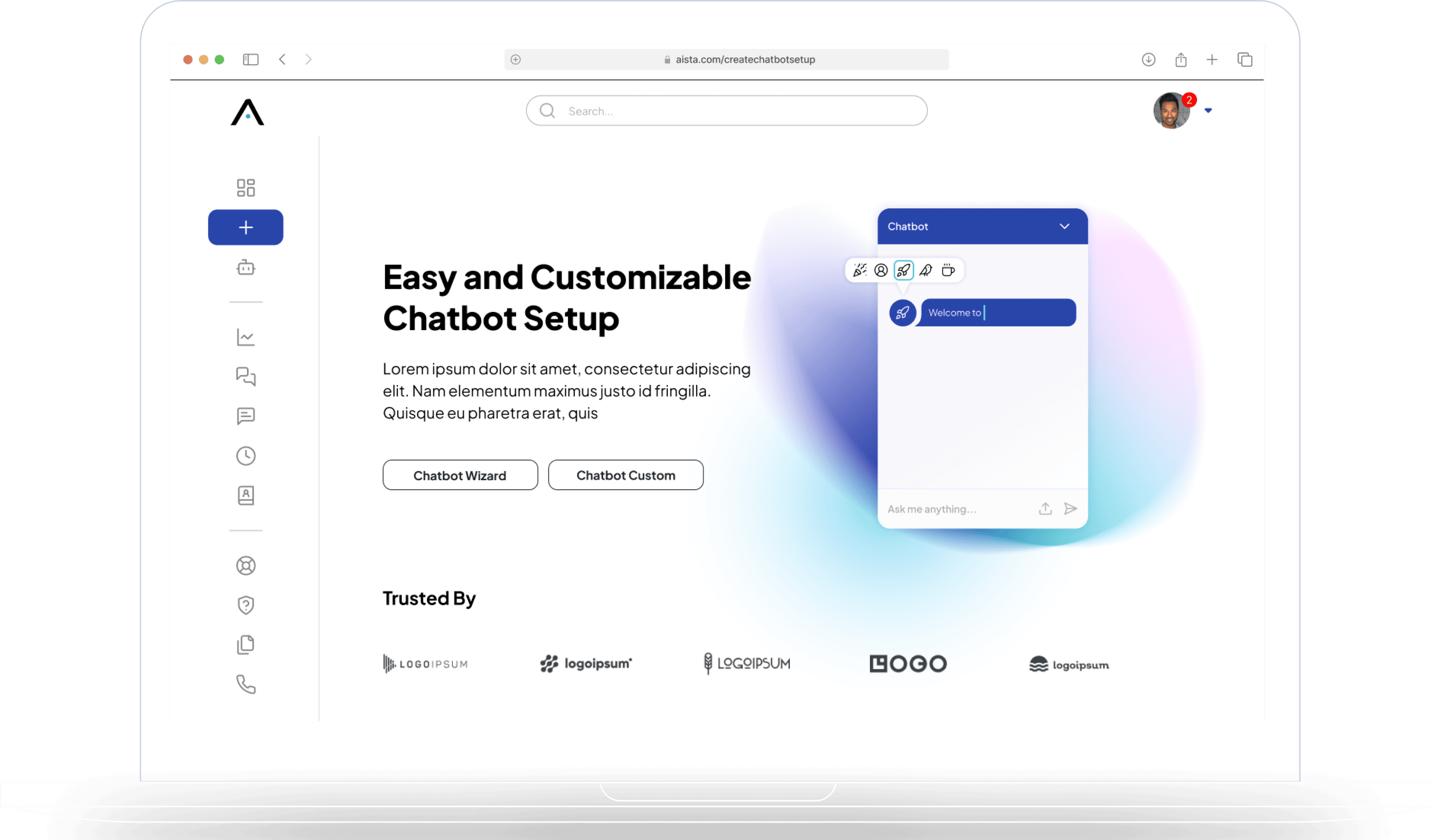
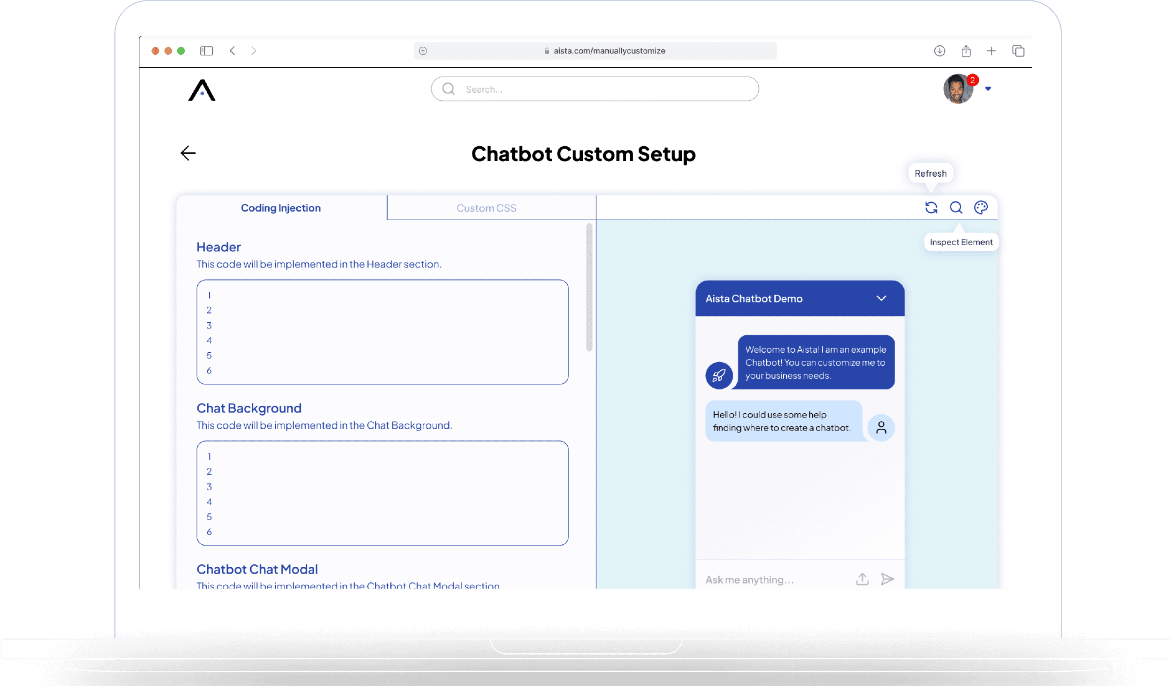
After considering user flows, UI research, and client input, we developed mid-fidelity wireframes. These wireframes were designed to guide users, both those new to chatbot creation and experienced coders. Jakob's Law informed our approach, emphasizing a familiar text editor for coders. We also ensured a user-friendly entry point, allowing users to start creating chatbots immediately. I oversaw the 'Manually Create a Chatbot' process, focusing on code-related components, including the inclusion of 'Custom CSS' and 'Coding Injection' sections. I also implemented a 'Preview' element for users to view their Chatbot, along with a dedicated section for users to access various markup language references.

3
Design
UI Iterations
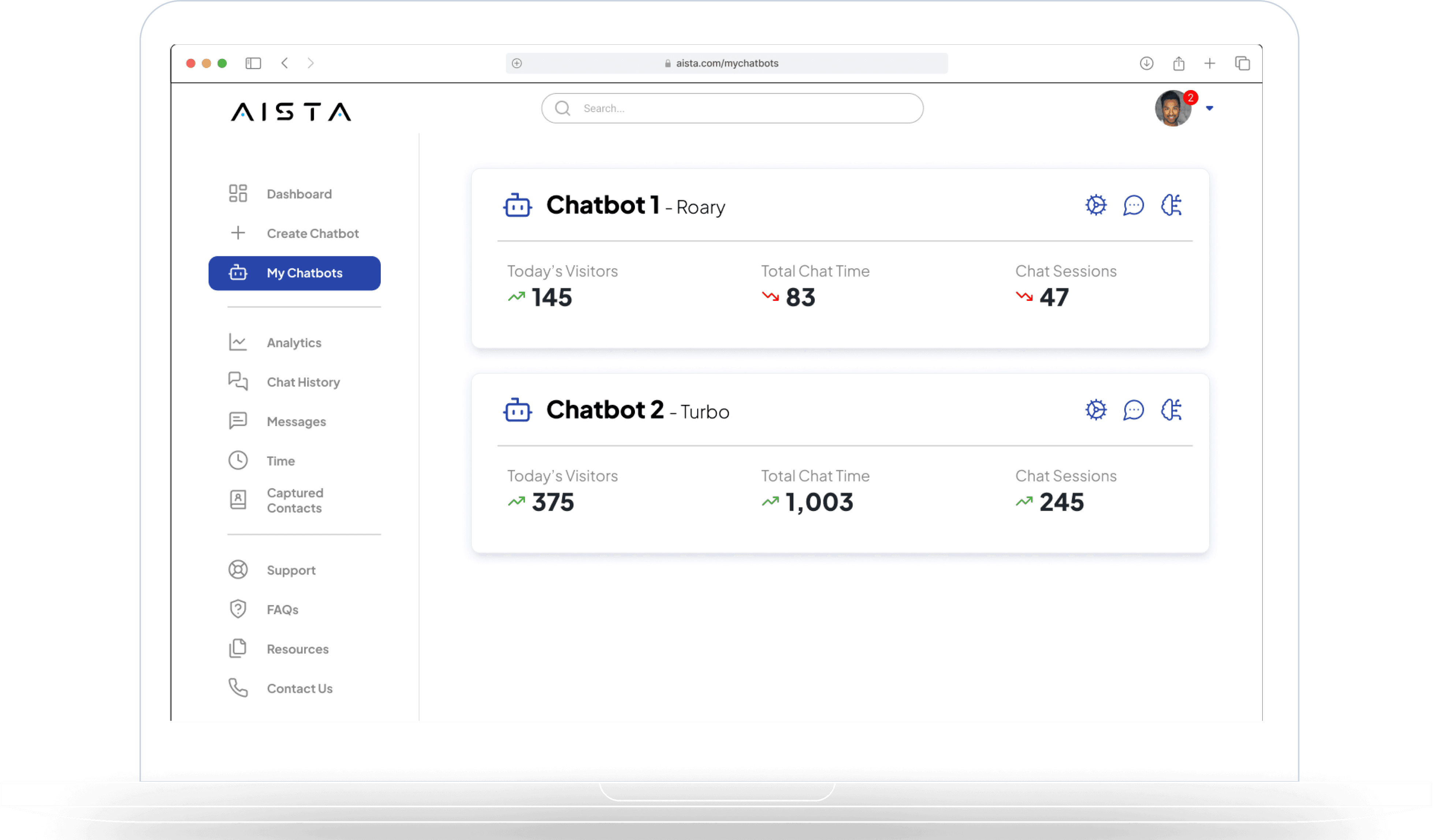
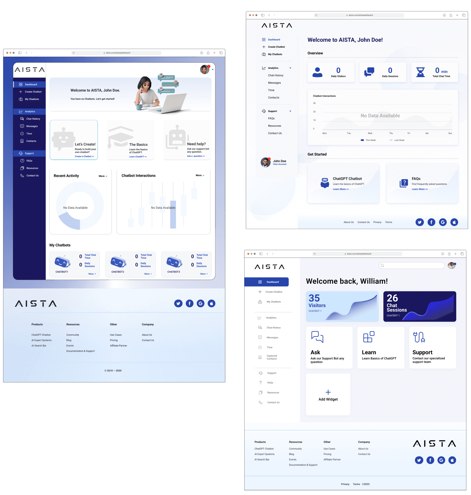
In our collaborative effort, all five team members have developed a High-Fidelity version of the wireframe on the left, which originally stems from one of my teammate's designs. It's worth noting that this particular screen is a common element across all team members' screens, as it serves as the landing page after a user logs in.

Our primary aim in this exercise was to seamlessly integrate the pre-existing graphics into this new layout, ensuring visual consistency. As we progress, the team will remain committed to upholding the updated and refined style. Ultimately, we will collectively vote on the top three designs that will advance to the next stage of development.
Top 3 Iterations
The top three designs chosen by the team for further development all adhered to the pre-established UI style, though they presented distinct content and layouts.
1
Naisha's design stood out due to its eye-catching call-to-action banner at the top and the flexibility it offered in terms of content placement on the page.
2
Belinda's design featured a classic dashboard layout with a variety of card sizes and diagrams, skillfully incorporating shadows and graphics for a sophisticated and elegant appearance.
3
My (Rachel's) dashboard design took a modular approach, allowing users to customize their dashboard by adding widgets. These widgets could display diverse information from different areas of the website. The design would built up with the stylization of the widgets.
1
2
3
Final Iteration
During client feedback, preferences from our iterations varied. They favored the second iteration but liked the third iteration's navigation bar and icons, as well as the first iteration's call-to-action header. All three team members collaborated on the final version. I spear headed the elevated look and feel of the design.
Hi-Fi Screen Evolution
The most important screen out of all the screens was the 'Manually Customized Chatbot’ screen, in particular the 'Coding Interjection' tab. This went through several versions. Below show the progression between main three versions.
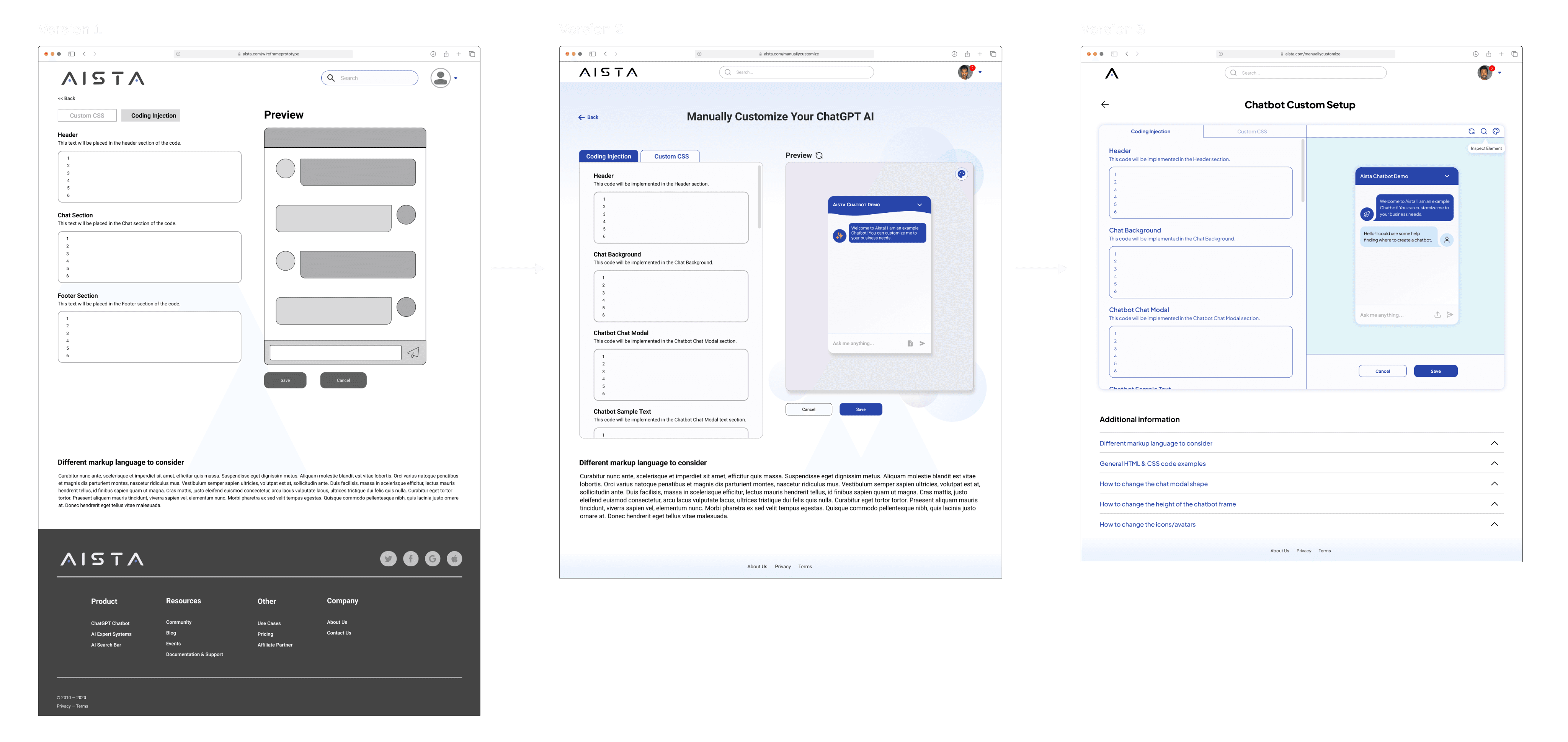
Version 1 : This is where I blocked off all the elements that need to be implemented. Such as the coding terminal, a live preview of the chatbot, a back arrow option, and a code information section at the bottom of the page. Having the chatbot above the informational content engages the concept of the 'Paradox of the Active User’ by allowing the user to dive into coding but have information available if needed.
Version 2 : This is where stylizing comes in. In this version, I tried to implement design elements that were pre-established by the client such as the orb graphics and color scheme. I was also working in tandem with a teammate who was working on the 'Chatbot Wizard’ (automated chatbot setup). Our goal was to make our screens look similar because they are similar in functionality. Some notable features that evolved for my screens were more interjection sections for the code, a chatbot preview with the artboard background, plus a simplified footer. There is also a refresher icon next to the preview and an icon for changing the color of the artboard background.
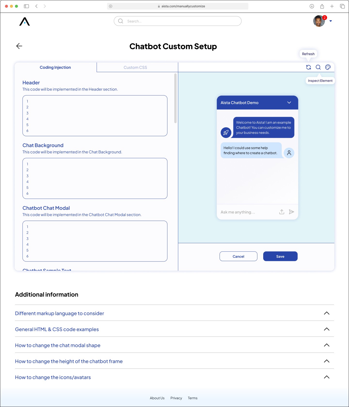
Version 3 : Cleaned up the look and better utilization of the screen by merging the separate coding and preview sections together. Moved the section up so that when the user is viewing the screen they can see the coding terminal and preview immediately without scrolling down the page. Also, combine the ‘refresh’ icon and the ‘change background color’ icon in the upper right corner of the preview section. An additional ‘inspection’ icon was added so users could see the code. For the bottom of the page, I added accordion-style information for the user. This way the user can quickly look for the information that is needed without cumbersomely scrolling through the content.
Hi-Fidelity UI’s
In crafting high-fidelity UIs, this stage became pivotal as I seamlessly incorporated all the elements gathered from the user flows, wireframes, iterative design processes, client input, and hierarchy refinement into the final design. My focus was not just on merging these elements but also on ensuring their precise alignment with the established grid system and maintaining consistency through the 8px spacing system. This meticulous attention to detail resulted in a polished and visually cohesive user interface that not only met design standards but also resonated with the intended user experience.
Slideshow of Wireframes:
4
Hand-Off
During the development hand-off phase, I took meticulous care to provide in-depth explanations for every element and feature, complemented by precise measurements. This information was thoughtfully structured in a logical sequence, commencing from the 'Chatbot Setup' page and extending seamlessly through to the 'My Chatbot Dashboard.' It was imperative that the developer received impeccably detailed information, leaving no margin for error in the implementation process.

5
Reflection
Reflecting on my website's development, I've added key features to enhance user experience and simplify chatbot development: a live preview for instant background color changes, ready-made code sections following the "Law of Playing into the Paradox of Least Effort," code interjection sections to encourage immediate use, a consistent and user-friendly flow, and a friendly mascot to add a personable touch. Looking ahead, I plan to include more detailed code information and guidance on inspection. Leveraging my research and graphic design background, I will continue to refine the website based on user feedback to further enhance its functionality and usability.
