EyePractice
EyePractice, an eco-conscious start-up, creates school and art supplies from recycled materials.
Services:
Graphic Design
Branding
Packaging

Challenge
Make a product that pops on the shelves and sets the look of the product apart from the rest of the competition.
My Role
Graphic Designer
Tools
Photoshop
Indesign
Illustrator
Solution
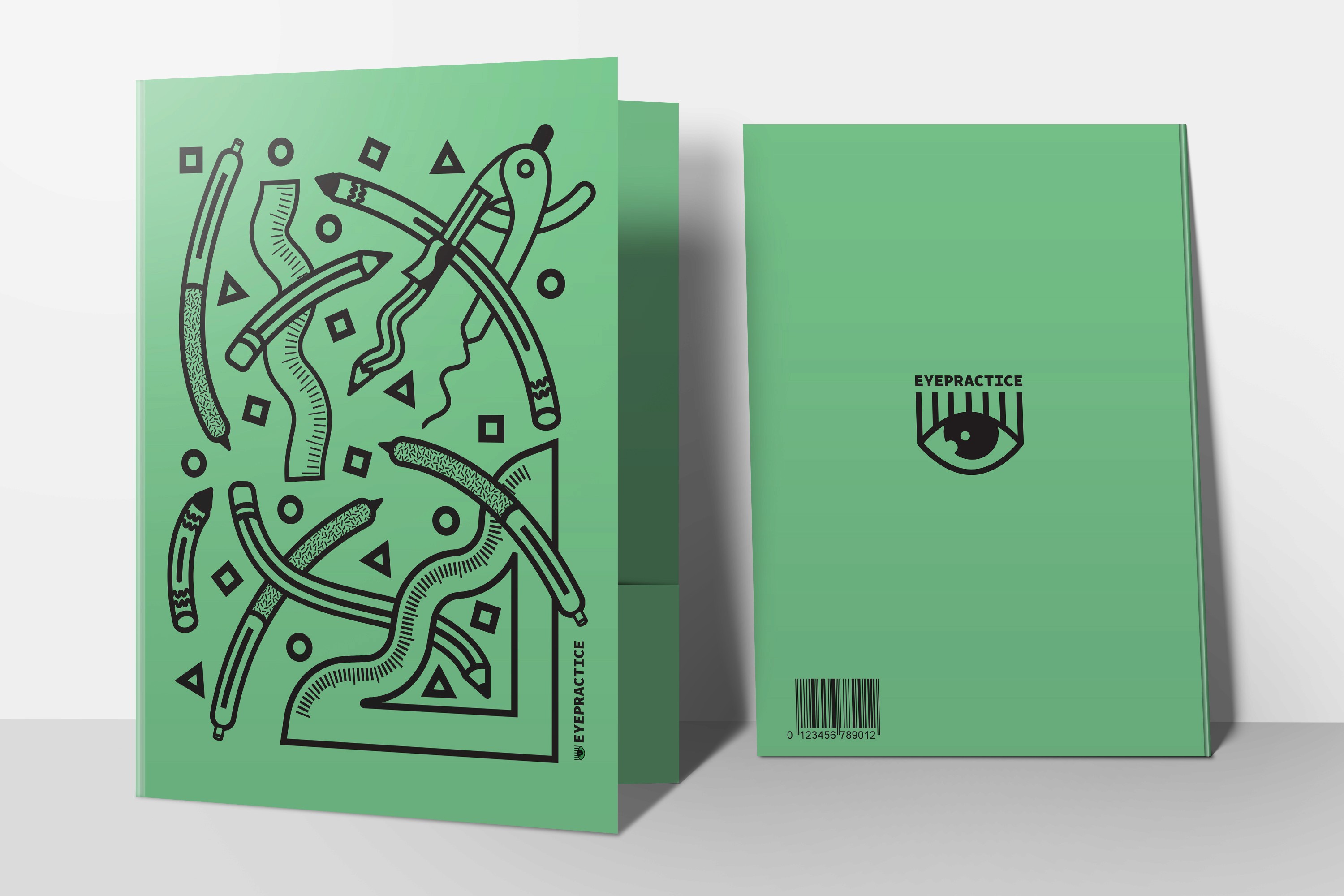
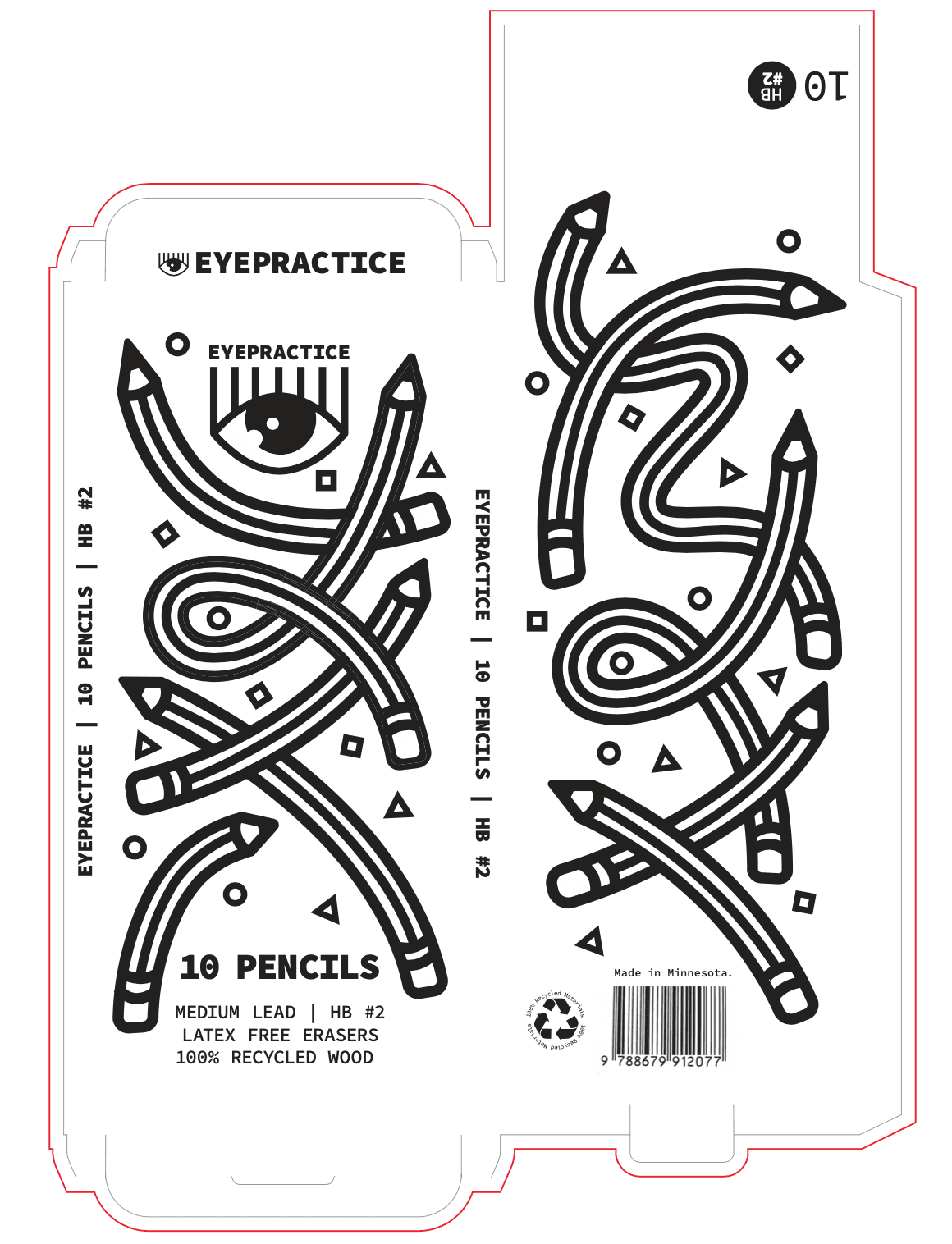
EyePractice is a company that creates school and art supplies for people of all ages. They are a start-up company that want their product to pop on the shelves. They are a eco-conscious making most of their products out of recycled materials. This design reflects a series of designs that provide playful elements on packaging and school supplies. Decided to do a one-color printing process where the color is utilized by the choice of cardstock color. This is a high contrast to the colorful and realistic layouts on current competition.
Process
This design concept hit me like a ton of bricks. I instantly imagined pencils as squiggly lines after I heard the brief. I created this sketch and dove right into the design. I made extra thick lines with the pen tool in Illustrator to block out the design. Then I expanded it to make pencil, pens, markers, crayons, and chalk out of the expanded shape.

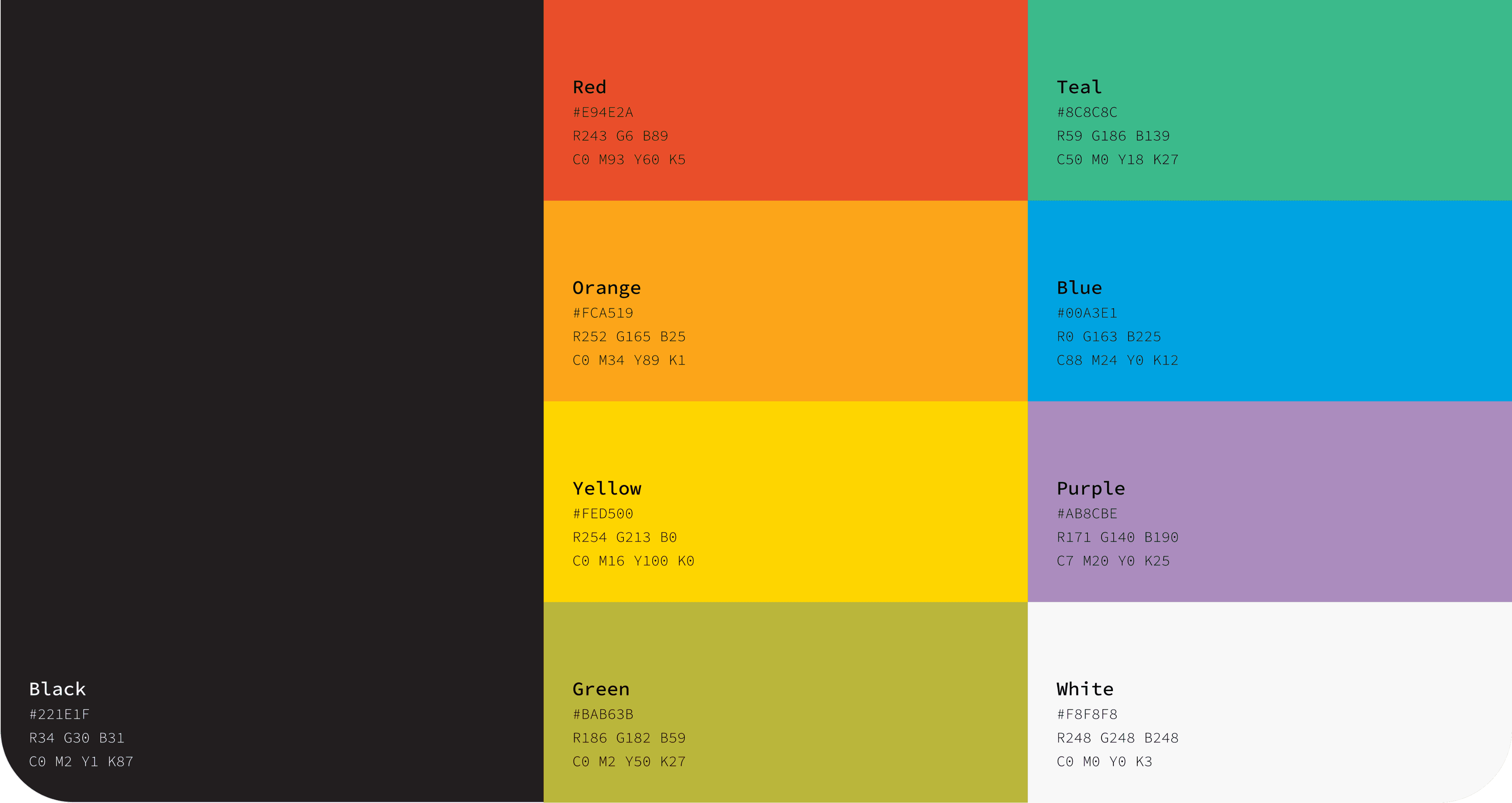
Source Code Pro
The quick brown fox jumps over the lazy dog.
aa bb cc dd ee ff gg hh ii jj kk ll mm nn oo pp qq rr ss tt uu vv ww xx yy zz
< > ? ” \ ’ , . : ; { } [ ] + = - _ ( ) * & ^ % $ # @ ! 1 2 3 4 5 6 7 8 9 0
light
Regular
Bold


Design
The careful choice of making ordinary objects playfully linear is what makes this design successful. In addition to the bold color choices to the collection as a whole, the overall look is eye candy on the shelves.


Variety
What’s unique about the brand is that it is like a collection. Each art supply has a slightly different design but they all relate with the linear layout.