
Laughing Lollipop
A family-friendly candy shop in a surf and history-rich tourist destination called the Outer Banks (OBX), NC.
Services:
Graphic Design
Branding

Challenge
To create a logo the meets the demands and versatility of the business needs. The client has a logo that has proven to be difficult to use.
My Role
Graphic Designer
Tools
Photoshop
Indesign
Illustrator
Firefly
Solution
Design a logo that effectively captured the business goals and ensured it stood out from the competition. The result was a memorable and distinctive brand identity with a vintage look, perfectly aligning with the company's nostalgic theme while making a strong visual impact in the market.

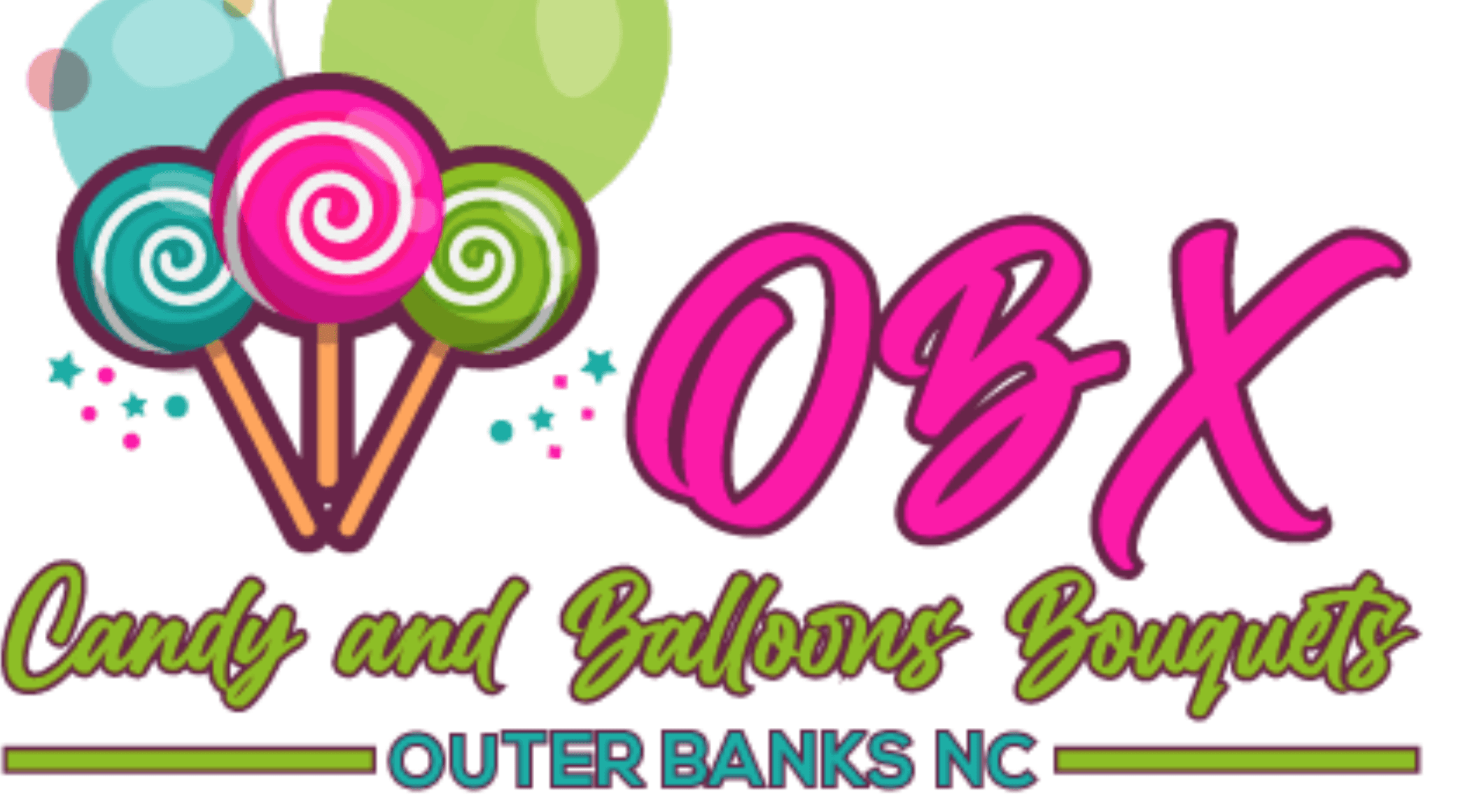
Original Logo
The old logo lacked versatility especially when it came to printing merchandise. There were too many colors which made certain processes more difficult, especially with screen printing and embroidering. The customer also wanted a throwback vibe to the branding because they sell classic nostalgia candy.
Research & Brainstorming
I began the research process by collaborating with the client to develop key words that clarified the desired tone for their business. Next, I created mood boards to capture the look and feel of the brand's future direction. Finally, I conducted competitive research to identify how we could differentiate the brand and stand out in the market.


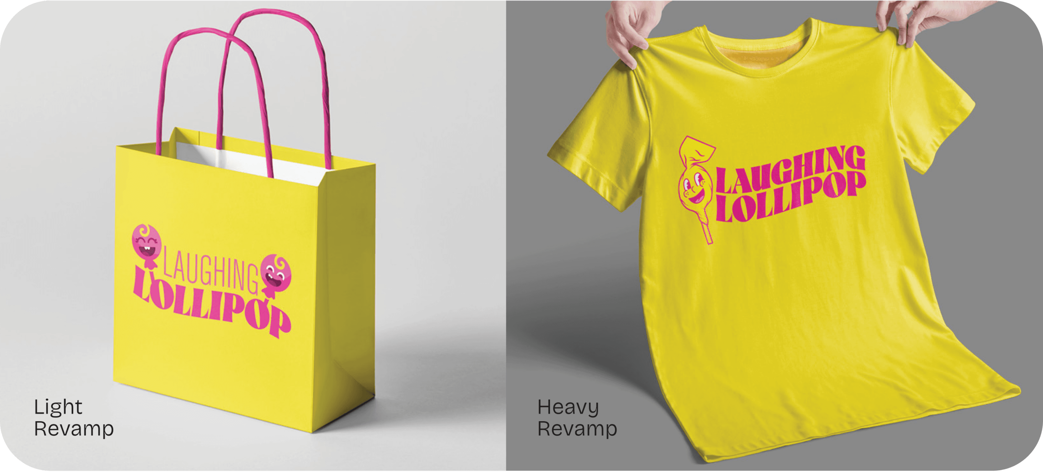
Light vs Heavy Revamp
Below is the original design I presented to the client. They wanted to retain the essence of the original logo, but I felt the composition could be improved with some layout adjustments.
Light Revamp: I kept the original layout but simplified the colors. The stylization of the lollipops was inspired by the playful and fun graphics from the Netflix series Headspace.
Heavy Revamp: I retained a few colors and the wave in the text from the original logo. For the lollipop image, I opted for a more vintage look with a pie-eye, paper-wrapped lollipop.
Logo Inspiration
The final logo was inspired by mascot logos, particularly the rubber-hose/pie-eye style reminiscent of early 1930s cartoons, giving it a nostalgic, throwback appeal. This timeless style resonates with people of all ages and adds a touch of retro charm to the brand.

Final Design
The logo was designed with a rubber-hose/pie-eye style for a vintage feel, while the typeface—a blend of 70s/Willy Wonka-esque and modern elements—adds a contemporary touch. The color scheme and wave in the text were inspired by the previous logo, but the overall design was a complete uplift. The slogan "Live the Sweet Life," discovered in old social posts from the previous owner, was incorporated as a sweet addition that both the owner and I felt perfectly captured the brand’s essence.


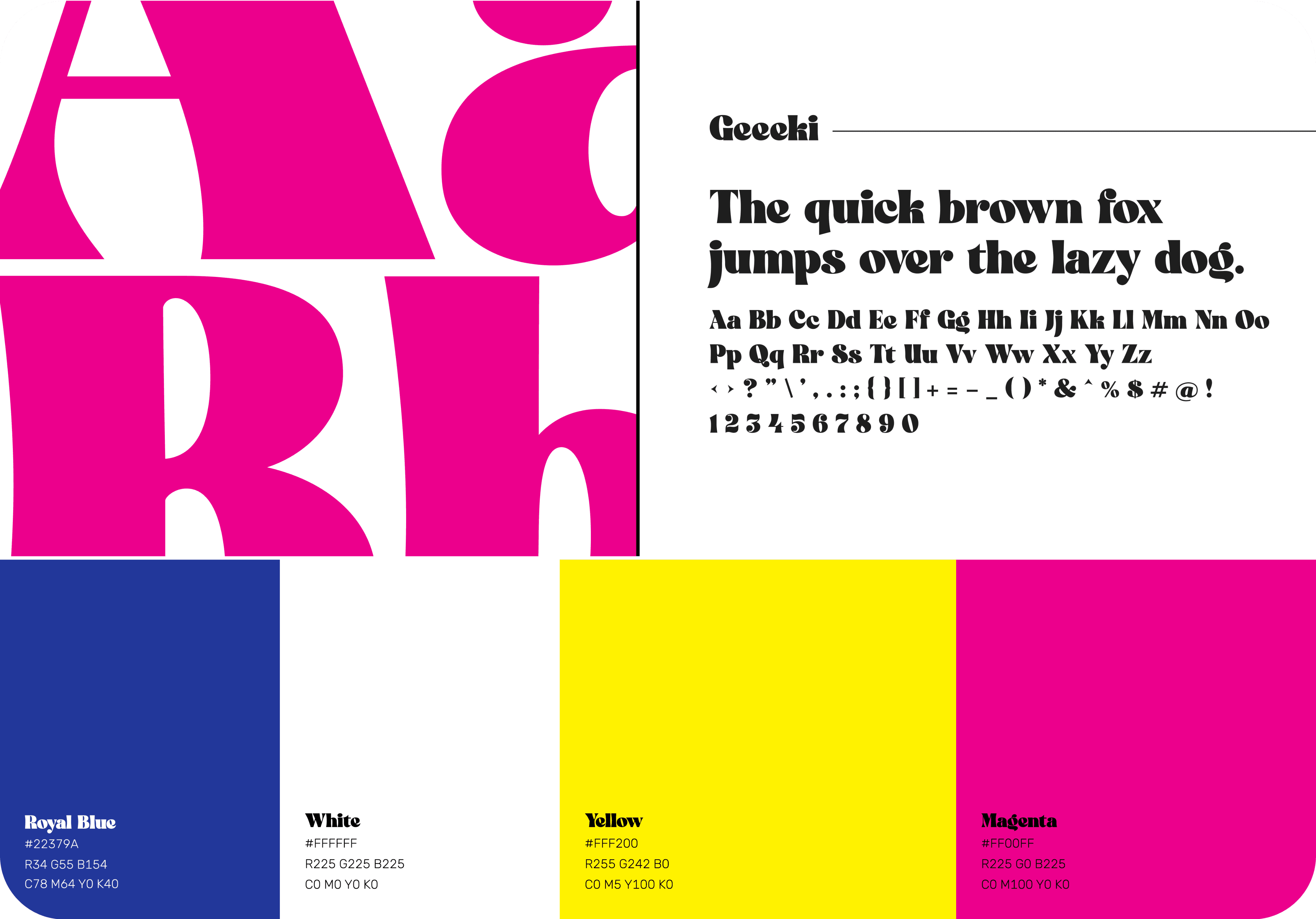
Color Scheme to Blend with Existing Structures
The new branding needed to complement existing structures and graphics for a cost-effective transition. With exterior walls and signs featuring a royal blue background and yellow and magenta overlays, the logo had to incorporate these elements to maintain consistency.


Hang-Loose Design
The customer has merchandise that they sell at the store and they wanted a fun shirt design that plays upon the culture in the Outerbanks. Fun shirt designs were also implemented for merchandise. Outerbanks, NC is known for their surfing culture. There is where the hangloose/ shaka variation of the logo comes in hand; giving the consumer beach vibe candy shoppe souvenir. The shirts also come in a variety of colors and layouts to fit a variety of clientele.

Variety
The logo was designed for easy application across various products and formats. Staff wear 70s/80s ringer shirts to enhance the shop's vintage vibe, while the hang-loose variation taps into the local surf culture. The logo's flexibility allows it to fit seamlessly into circular, square, and rectangular layouts.
