Liveliness
A SaaS mobile community sports app that regionally unites people for practice, play, and skill development.
Services:
UX/UI Design
App Design

Challenge
The challenge was expanding the app from coach-focused features to include athlete-specific ones, aligning with our client’s vision for a more personalized and inclusive sports app.
Project Duration
6-Months
Team
1 - Developer
1 - Project Manager
1 - Design Lead
5 - UX/UI Designers
Process
Discovery
Ideation
Design
Developer Handoff
Tools
Figma
Figjam
Zoom
Slack
Photoshop
Illustrator
Solution
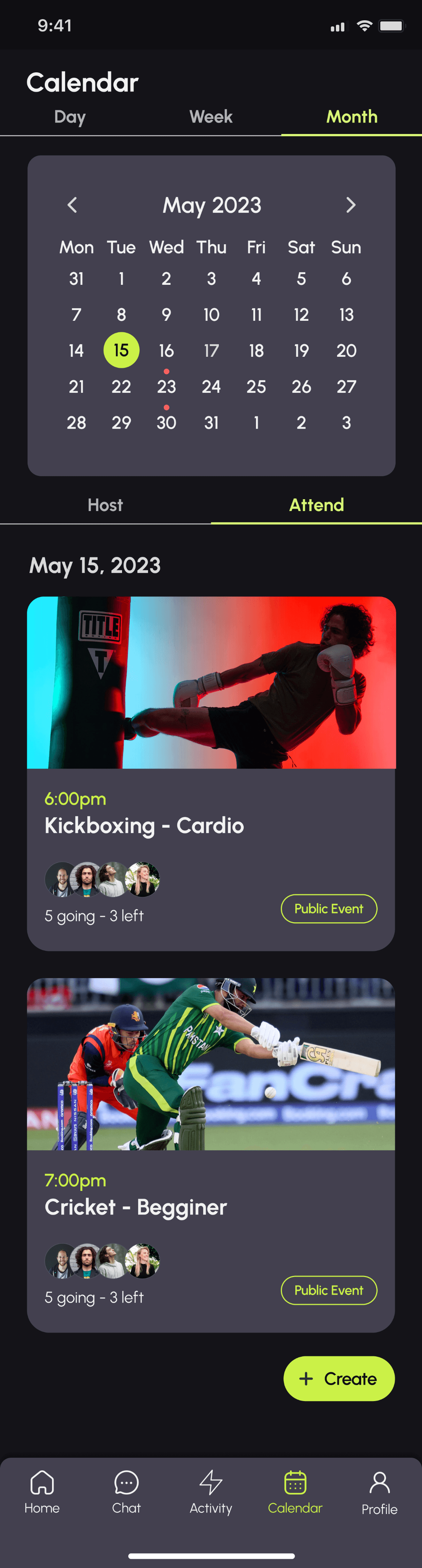
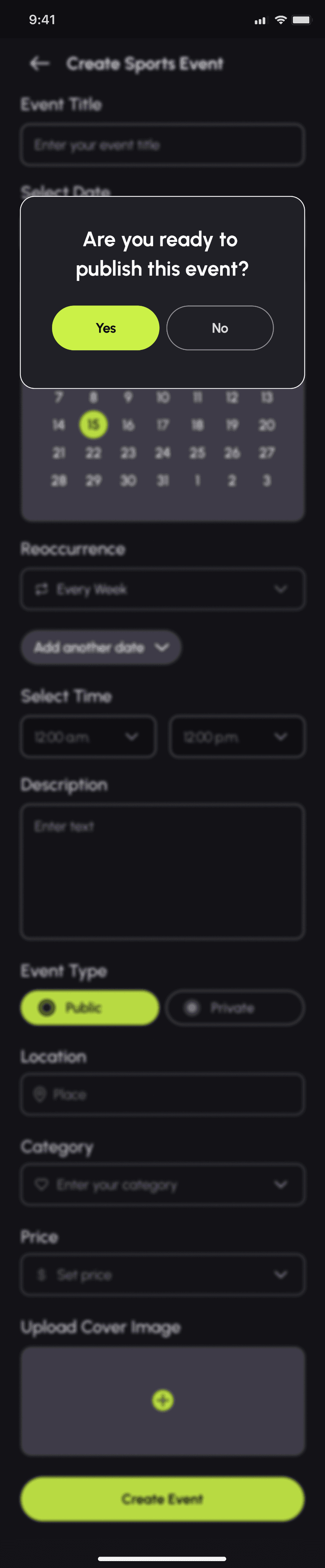
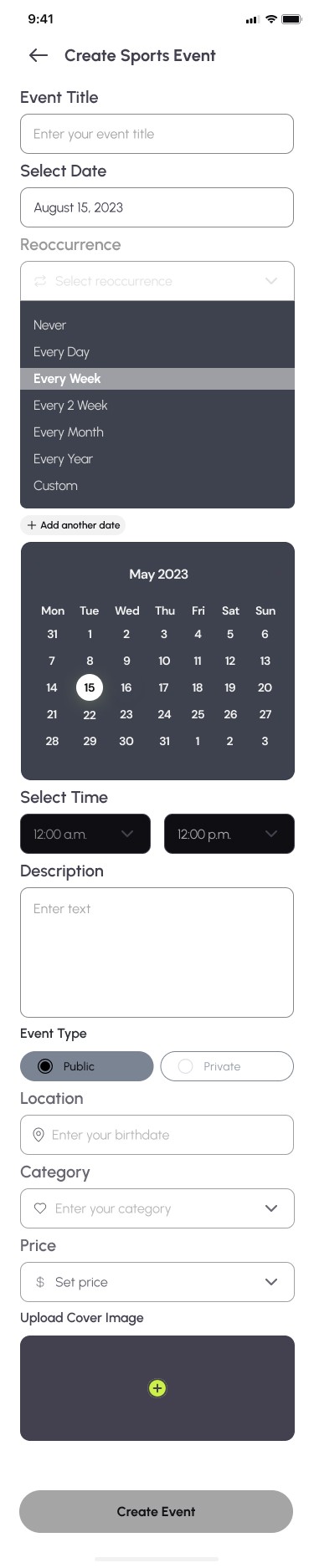
To address the challenge, we devised user flows specifically designed for athletes. For example, we constructed our user flows with 'As a user (athlete)’ in front of each flow. This collaborative effort involved working together as a team to brainstorm and develop innovative concepts that empathized with the athlete. My part was to work on the 'create event flow' that includes a calendar page, host/attend tabs, and confirmation screens. Throughout this process, the team maintained the integrity of the design, ensuring that the user experience remained cohesive and user-friendly.


1
Discovery
The team convened for our kick-off meeting, during which we examined the resources provided by the client. This included user flows, high-fidelity designs, and style guides furnished by the client.
Additionally, the client supplied us with a set of user stories, which we distributed among team members, assigning each teammate specific responsibilities aligned with these user stories. This collaborative effort laid the foundation for our project and ensured that everyone was aligned with the client's objectives and expectations.
Client Questionnaire
The team collectively formulated a series of insightful questions aimed at gaining a deeper understanding of the client's brand, aspirations, requirements, and objectives. These questions were crafted to unearth the client's goals, sources of inspiration, and expectations, ensuring that our development aligns seamlessly with their brand and vision.
Who are your main competitors?
Are there any brands or companies that are of inspiration?
What are 3-4 features that you would like us to focus on?
What do you like and dislike about your current design?
Where do you get your current design inspiration from?
What features do you like/don’t like from competitors? How would you like to be set apart from them?
Who is your target audience?
What feedback have you received from users?
Q&A Insights
Key insights gathered from our client reveal a firm commitment to maintaining the elegant, minimalist aesthetics of their current design, characterized by its enduring green and black color scheme. In addition, the client expressed a strong interest in the development of specific sections, notably the 'create/book classes' feature and 'create/view profiles' functionality. Their vision envisions a platform that combines the social dynamics reminiscent of dating apps with a sharp focus on fostering athlete connections. In shaping this vision, they draw inspiration from a diverse range of digital platforms, including dating apps, Spotify, Dice, VSCO, Twitter, and Airbnb. Moreover, their keen awareness of industry competition centers on key players such as Bumble, Meetup, and Playtomic.
2
Ideation
User Stories
The client supplied us with distinct user flows, expressing a keen interest in enhancing features from the athlete's standpoint. Thus far, many functionalities have primarily catered to coaches for organizing and creating events. I was tasked with user flow #3.
1 As a user (athlete), I want to search for coaches and sports instructors.
2 As a user (athlete), I want to view the classes offered by a specific course or instructor.
3 As a user (athlete), I want to be able to create a sports event.
a. Can be public (all users) or private (connected users).
4 As a user (athlete), I want to search for coaches’ classes.
a. Filter by private/group class
b. Filter by sport
User Flows
We translated our user stories into user flow pathways, a highly effective visualization technique that aids in comprehending how users will logically navigate specific tasks. This approach closely aligns with the concept of implementing a Mental Model, as we systematically create user flows that align with users' expected logical sequences of actions. I was assigned User Flow 3, where creating an event from the athlete’s perspective needed to be evolved. Knowing where to intuitively place where the function would go in the application was the trickiest part.

UI Inspiration
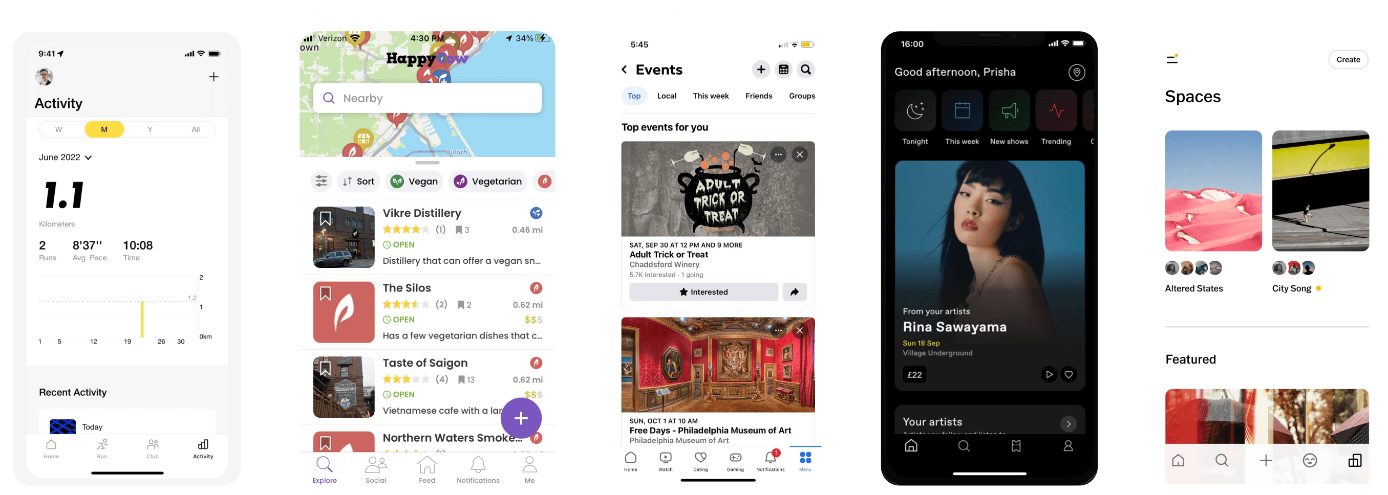
We broke out into a brainstorming session. We blocked off how the existing wireframes should look according to existing screens provided by the client and our user flows. The team conversed about each flow. To gain inspiration and insights, we drew upon the successful features of well-established applications with features similar to Liveliness. This included analyzing the data-driven interface of the Nike app, the social networking capabilities of Facebook, the regional search proficiency of the HappyCow app, and the sleek yet highly effective design elements of DICE and VSCO.
Existing Product Evaluation
Nike Run: Has a clean and simplistic style. It uses typography hierarchy effectively showing stats and information about the athlete. This isn’t a direct competition but a great example of what sports apps are trending towards. This app even has calendar options that show week, month, year, and all.
Happy Cow: Since the Liveliness app regionally finds events and people to join, the Happy Cow app is a vegan/vegetarian app that regionally shows food options nearby. Since some of our user flows have a search section to find coaches and events, Happy Cow is a great example of figuring out where niches are located.
Facebook Event: This is where many people’s mental model come from when they are looking up social events. Facebook is a great starting point to see people’s expectations when looking for events and creating events. Generally, they expect an image then what, where, and when information.
DICE: This is another event application but it has a sleek/hip modern appeal. This application also has a different perspective on how to search events by personalizing recommendations by creating an algorithm search by a user’s favorite artists.
VSCO: This is a minimalist photography app that emphasizes the use of beautiful and colorful imagery to enhance the look and feel of the application. A great example of creating beauty through minimalism.
Mid-Fi Wireframes
I constructed a wireframe using the insights gathered from our brainstorming session, user flow analysis, and user stories, with a particular focus on user story #3. This approach effectively allowed us to outline the essential components required for the pages.
As a user (athlete), I want to be able to create a sports event.
a. Can be public (all users) or private (connected users)
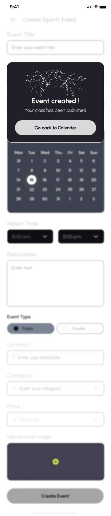
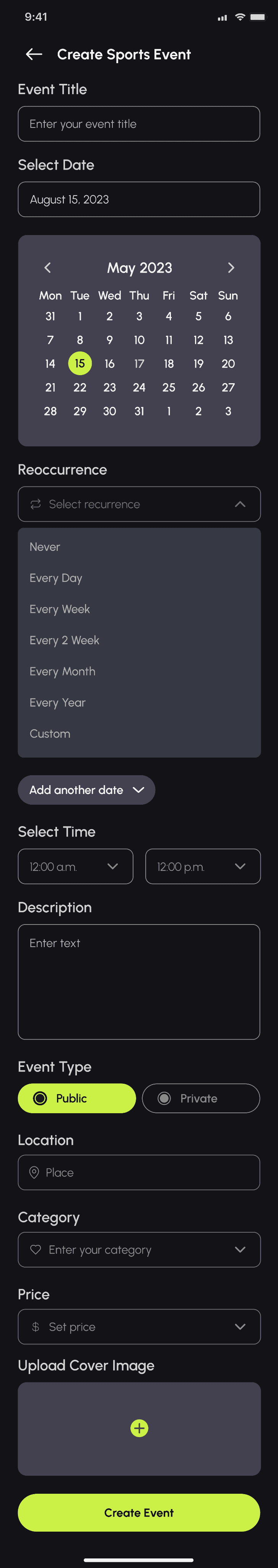
Some of the design elements that were implemented in this event flow are the main calendar page, 'create event' input pages, text fields, and confirmation modals.


3
Design

UI Iterations
To foster collaboration and innovation, all five team members contributed their own iterations, and we conducted a collective vote to select the top three designs for presentation to the client. Our primary objective was to enhance and harmonize with the existing layout while capitalizing on each iteration's unique strengths.
Top 3 Iterations
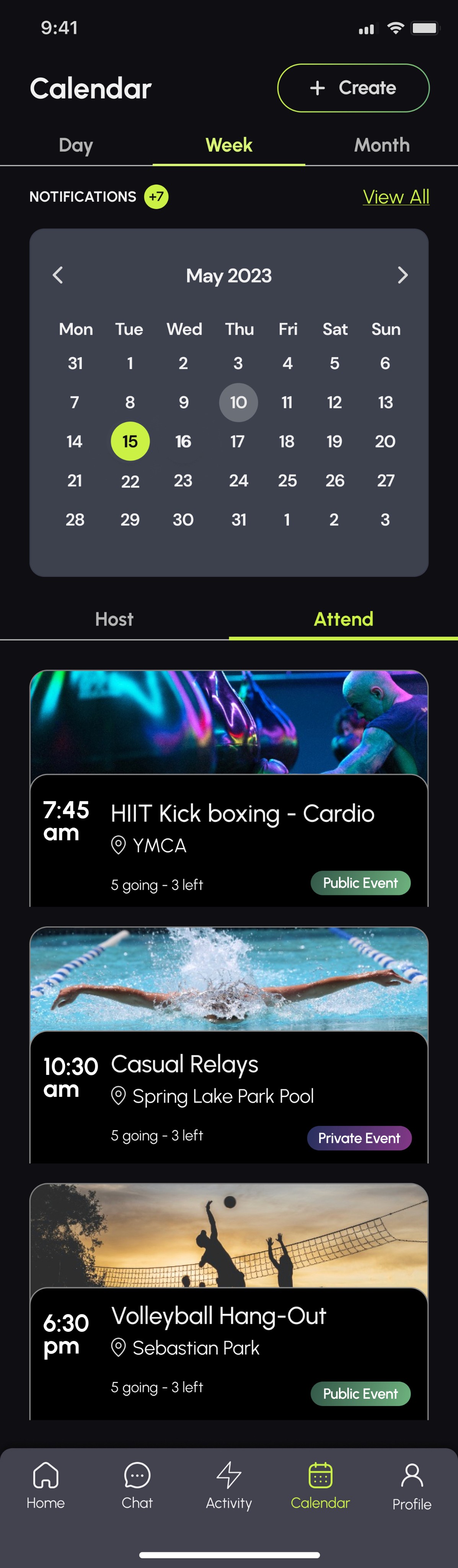
For the three iterations that moved forward, the calendar view retained a consistent appearance across all versions.
1
Iteration #1 introduced a horizontal layout, offering users a comprehensive view of multiple events.
2
Iteration #2 (My design) introduced a more stylized aesthetic with time positioned to the left of the card, a sleek horizontal image, and an outlined frame, with the added functionality of expandability upon user interaction.
3
Iteration #3 embraced a classic design, prominently featuring the sport with a large image and retaining attendee images from the wireframe, lending a sense of familiarity to the user experience.


1
2
3

Final Iteration
The client's preference leaned towards the third iteration. The team incorporated adjustments after engaging in additional discussions with both the client and the team lead. Notable modifications included:
A date display was added at the top of the cards, inspired by Olivia's iteration, to enhance user clarity regarding the day being viewed.
'Public Event' and 'Private Event' were outlined instead of using a gradient effect with flat colors. Furthermore,
Cards were refined with the addition of a gray bottom section, aligning them with the design of other cards in different flows.
Text hierarchy was also fine-tuned for improved legibility.
The '+Create Event' button was strategically placed at the bottom of the frame, ensuring it remained accessible as users scrolled through the page.
To enhance memorability, the Von Restorff Effect was applied to the '+Create Event' button, by making it stand out distinctly with a bold color among similar design elements.
Style Guide
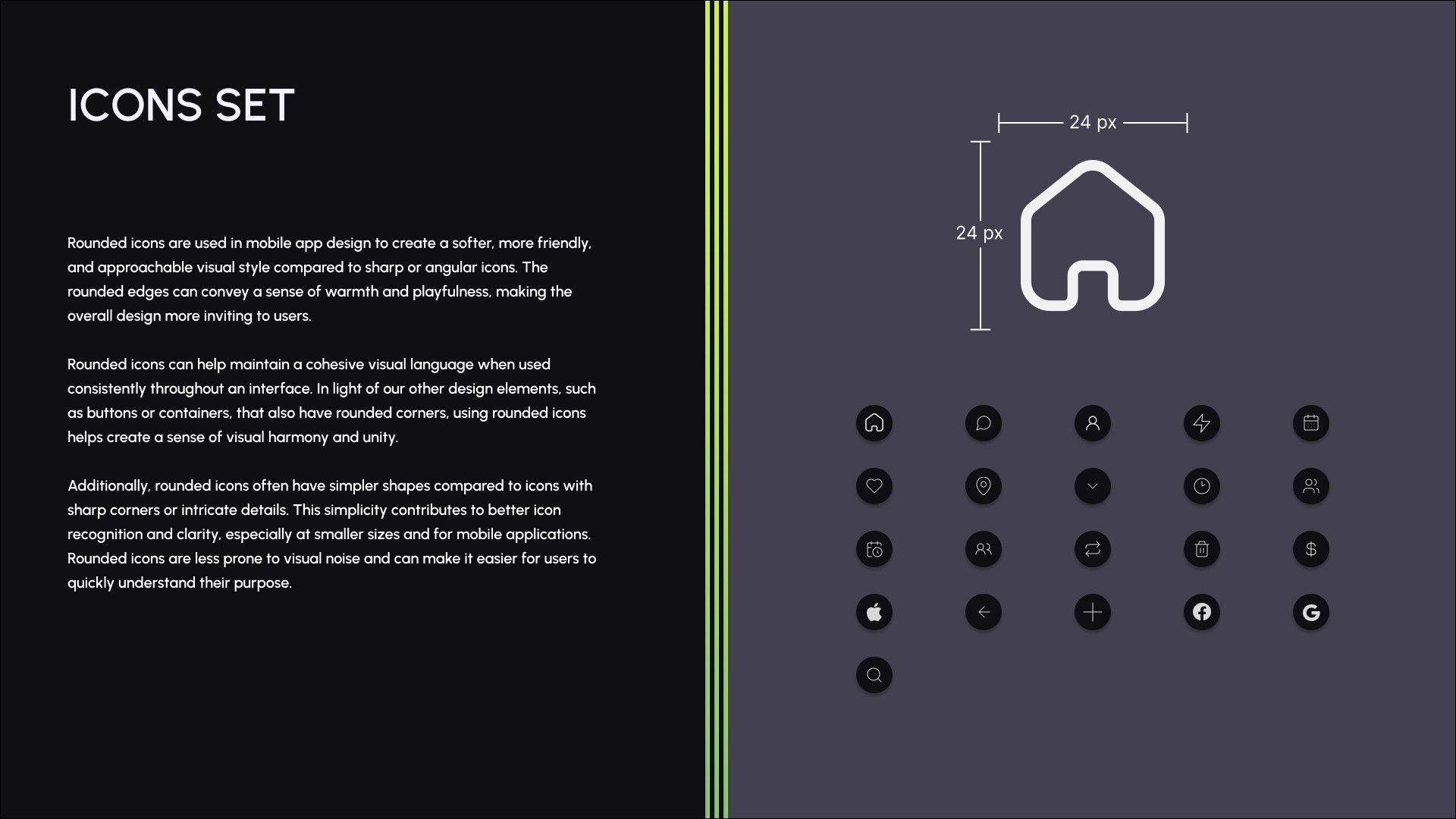
As a team, we came together and implemented aspects that we were developing into the layout. We broke down what components, graphic, images, and color scheme that was being followed throughout the design process. For the cover, first three pages, and last two, we worked as a team and discussed how we wanted the layout to look like. added the three-lined stripes to go with the branding of the logo, kept on following the established color scheme, and font provided by the client. Then each team member added their own components. I added input fields, calendar, event cards, modal, and reoccurrence buttons.


Hi-Fidelity UI’s
I developed high-fidelity designs, building upon the wireframes and the final UI to ensure alignment with the design elements specified by the client. While crafting these designs, I integrated updates derived from the final UI iteration, with a notable portion of the input fields being modeled after an existing client-created input field.
Key enhancements made included the addition of a calendar feature, reoccurrence input options, refinement of event type (public/private), confirmation modals, and the integration of an image upload feature. A dedicated calendar landing page followed the design iteration, maintaining consistency with the project's evolving vision. My major contribution to these elements was the look and feel of the calendar page. This is where I had a lot of control over how the typographic hierarchy looked and elemental proximity and consistency to the rest of the design.
Moreover, I meticulously constructed components, fine-tuned spacing, and adhered to our established grid system to guarantee a cohesive visual presentation. Collaborative discussions with fellow team members played a pivotal role in sustaining design coherence throughout the project. In a particularly efficient collaboration, a teammate and I jointly assembled this section of the UI, significantly expediting the process.
Slideshow of Wireframes:


4
Hand-Off
The development handoff process was characterized by meticulous attention to detail and clear communication. I provided comprehensive explanations for each feature in technical terms to minimize errors during development. I left no room for ambiguity and ensured that all spacing aligned perfectly with our 8px system, guaranteeing design precision in the final product.

5
Reflection
Reflecting on the Liveliness App UX/UI project, team collaboration proved invaluable, bringing diverse perspectives to the forefront and enriching our creative process. We discussed potential enhancements, such as implementing auto-fill in forms for quicker user interactions. Throughout the project, we emphasized teamwork, adherence to deadlines, adaptability, and clear communication, always prioritizing user-centric design principles.
Our project manager skillfully structured each phase, addressing client needs and project lead guidance with necessary adjustments. This experience highlighted the importance of adaptability to agile workflow on UX/UI projects.
As someone with a design background, I welcomed the opportunity to push the boundaries and explore unconventional design choices. The image on the right represents my desire to think outside the box and inject creativity into the project. Overall, this project served as a comprehensive learning experience that honed not only my design skills but also my ability to collaborate effectively within a team.
