
Totally Turnip
A mobile app that’s totally turning it up with plant-based cuisine for beginners to experts.
Services:
UX/UI Design
App Design

Challenge
I want to help people create healthy vegetarian or vegan alternatives, which can be challenging to do.
Project Duration
4-Months
My Role
Sole UX/UI Designers
Process
Discovery
Ideation
Design
Test
Reflection
Tools
Figma
Photoshop
Illustrator
Mirro
Loom
Otter.ai
Solution
This journey started as finding out if plant-based eaters as users needed an app that would help them find meat-free, and plant-based alternatives to their meals and thus ensuing into their daily lives. Also, People want to know what is in their food and what they are eating. Total transparency. It ended up turning into an application, Totally Turnip, that helps plant-based users navigate their nutrition and daily meal planning with ease and efficiency.


1
Discovery
Secondary Research
In my secondary research, I did a quantitative analysis of the nutritional needs that vegans and vegetarians run into. What are good plant-based alternatives? What health issues do they run into? Some conclusive findings were:
Many of the plant-based products on grocery store shelves are not necessarily healthy. They are still processed food that should be considered a treat.
There is a risk of being nutritionally deficient in specific vitamins and minerals such as iron and omega-3. It's beneficial for plant-based eaters to take supplements.
Primary Research
For the primary research, qualitative data was gathered using a research plan, screener survey, interview script, and interviews. The research plan laid out the hypothesis and what was going to be researched. I initially thought users were looking for something to make their traditional meat-based meals into plant-based options, but after the research figuring out what the user’s needs are this concept took a different direction.

Screener Survey
For the screener survey, I found participants via social media and created the survey with Google Forms. I screened applicants carefully with well-defined questions geared towards daily to frequent plant-based eating. Wanted to gather people who actively eat plant-based from meatless Mondays to vegans. Many of the participants were flexitarian and many had issues with finding a good plant-based food option.
Interviews
There were interviews with six participants. There was a broad range of plant-based experiences from beginners just starting to well-versed experts. Asked questions such as, what learning curves have you experienced? Did you have any nutritional issues? Do you run into any issues with recipe planning? How about on the holidays? What do you think of meat substitutes? What do you think would help you with this plant-based lifestyle? etc.
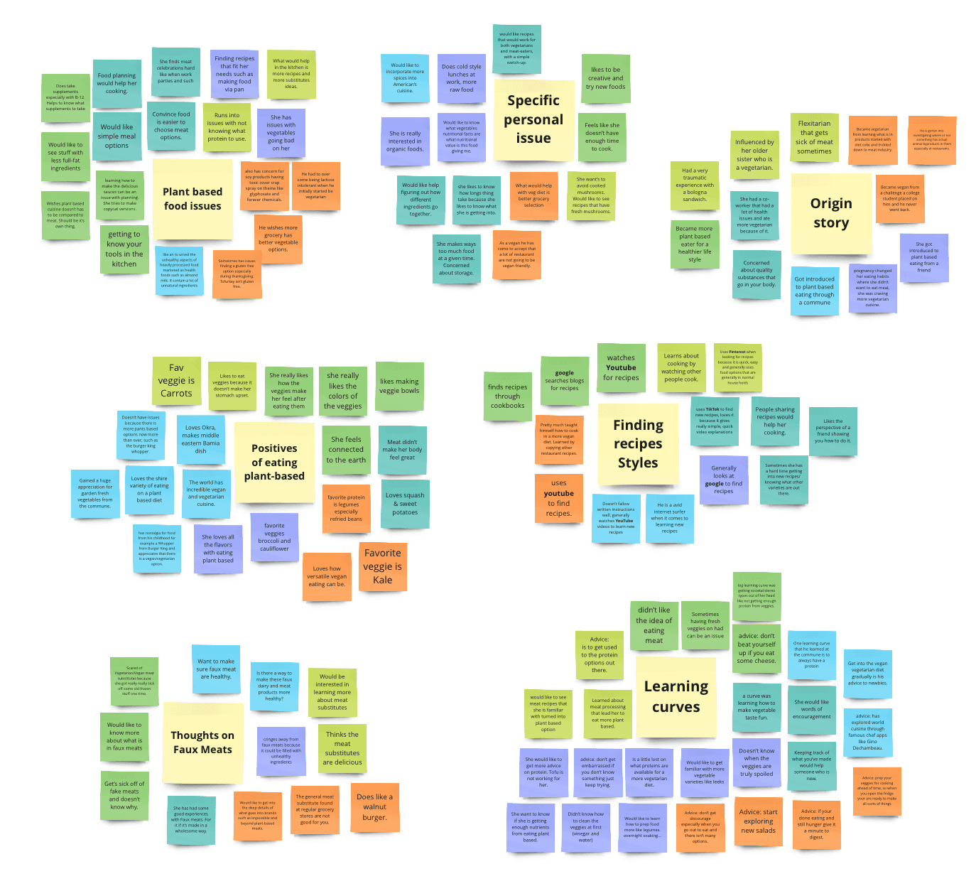
Affinity Maps
Affinity mapping was conducted to organize the information that was given in the interviews. There was a pattern of comments that arose through the affinity mapping which helped better pinpoint and gave insights into what the needs and points of view are for this particular audience.
Empathy Maps
The Empathy map helped get inside the head of the potential person. It’s important to understand what environmental factors are going on with a potential user, let alone their needs as a plant-based eater.


Personas
These user personas really help conceptualize and familiarize who the people you are designing for are. These personas were inspired by the people that I interviewed, affinity mapping, and empathy mapping.


'How Might We' Statements
How Might We (HMW) statements are a great launching point for brainstorming the needs of the people we are conceptualizing by defining strategic questions. These questions really helped me hone in on what is needed when I started the brainstorming process.
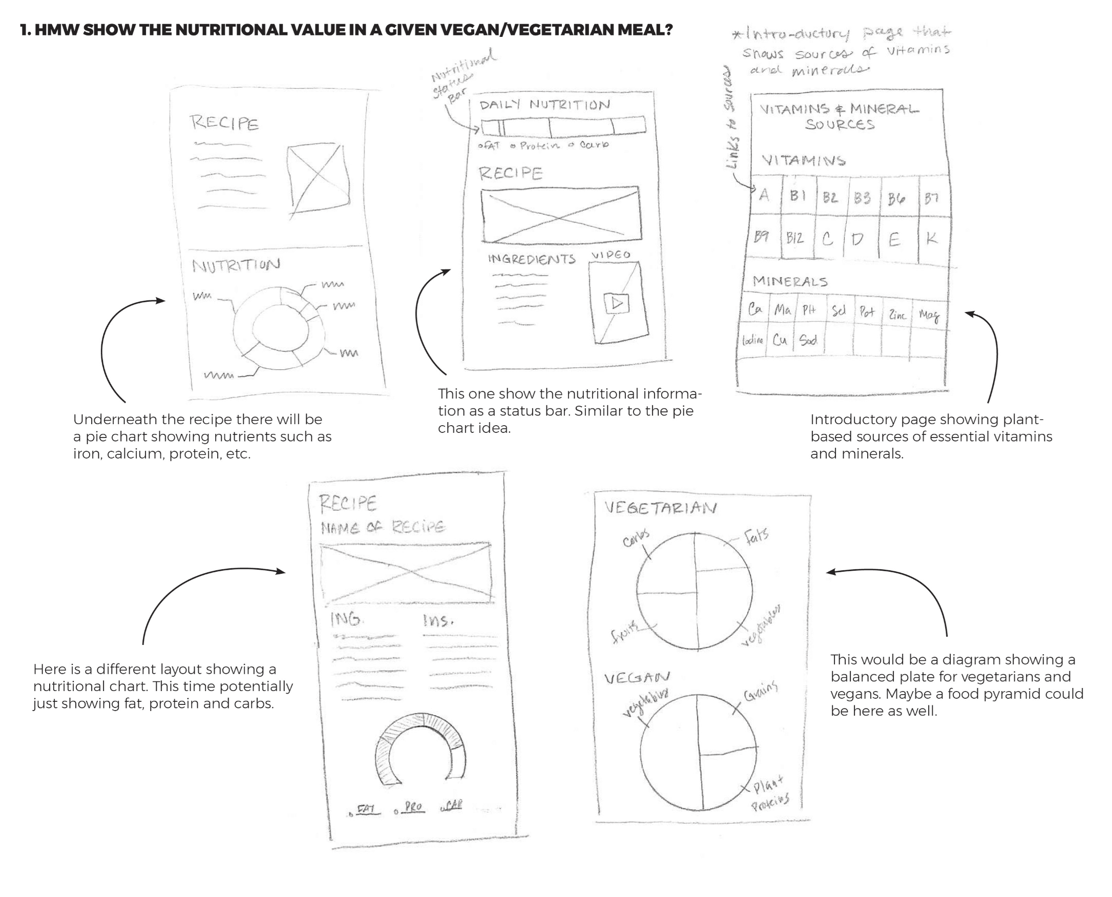
HMW show the nutritional value of a given vegan/vegetarian meal?
HMW give words of encouragement on their vegan/vegetarian journey?
HMW create flexibility with the user’s learning style?
HMW make finding a delicious recipe less overwhelming?
HMW teach and broaden user’s fundamental knowledge of vegan & vegetarian cuisine?
Brainstorm
With this brainstorming session, I took some of the HMW questions and visualized them with sketching. Did a brain dump of all the possible visualizations. This really helped to get in the mindset of what is needed in the application that targets the user’s needs.
User Stories
The user stories really help empathize with how the user would move through a given application and what needs they will need. Here I distinguished that newbie Rubie would want to know the nutritional value of a given meal while Intermediate Ivan would like to see how much time a given recipe would take.
As Newbie Rubie, I want to see the nutritional value of a given meal,
so that I can learn that I'm getting all the nutrition that I need.
As Intermediate Ivan, I want to see how much time a recipe will take,
so that I can gauge if I have the time to make the recipe.
As Pro Paulina, I want to see international recipes,
so that I can expand my knowledge of vegan and vegetarian cuisine.
As Newbie Rubie, I want to avoid certain foods such as mushrooms,
to enjoy my meals without foods I don't like.
As a user, I want to have gluten, nut, or dairy-free options,
so that I can avoid certain allergies or autoimmune issues.
2
Ideation
Site Map
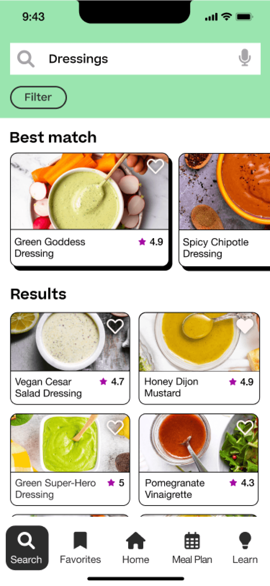
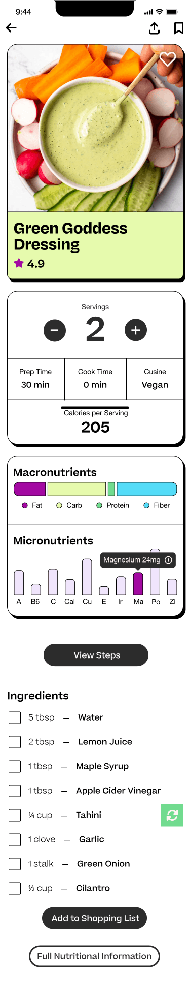
To get the overall structure that is potentially needed on the application, a site map was created. This really helped conceptualize the architect of what the site’s facets need to be such as recipes, search options, and a nutrition tracker.

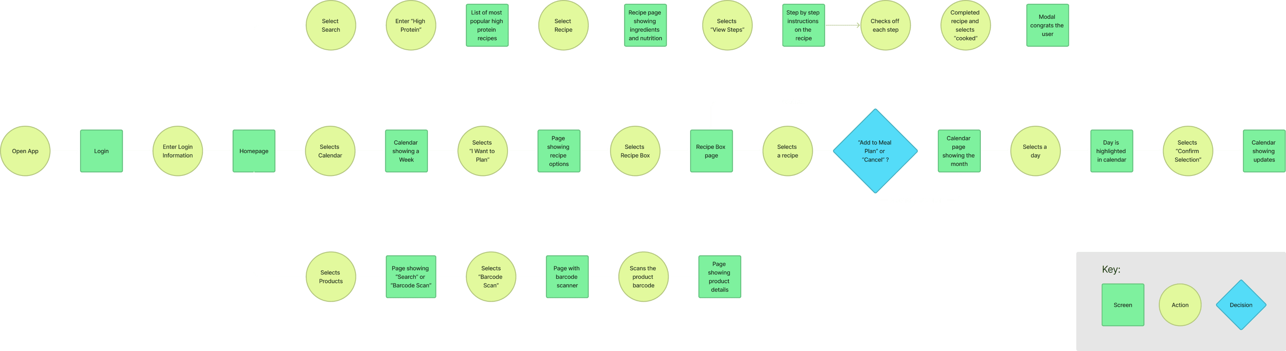
User Flows
The User Flow Diagram above is where I conceptualize how the user walks through the application and figure out how many pages I need to design. Where would they go to find a recipe? What would they be looking for when they plan a meal? What would they expect to see?

Sketches
Here is where I actualized the user flows. Here I ruled out what components were necessary and not necessary on each page. Some questions I was asking myself were: How are we going to further fit the needs of the user? What nutritional information do they need? What kind of experience is the search going to look like? With all of these questions, I would refer back to personas, affinity mapping, interviews, and app research to base my designs.
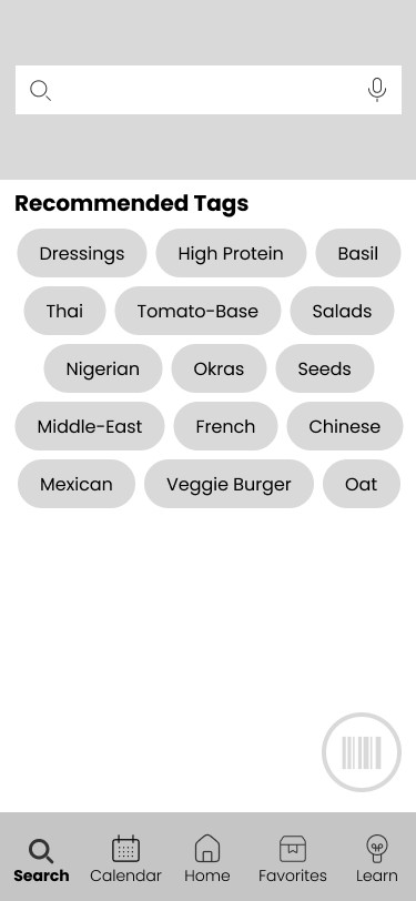
Wireframes
Here is where I’m setting a more concrete framework for the application. This helped with getting familiarized with what each page needed. What would the nutrition look like on the recipe page? What are some attributes that the user would need on the homepage?
Slideshow of Wireframes:


3
Design
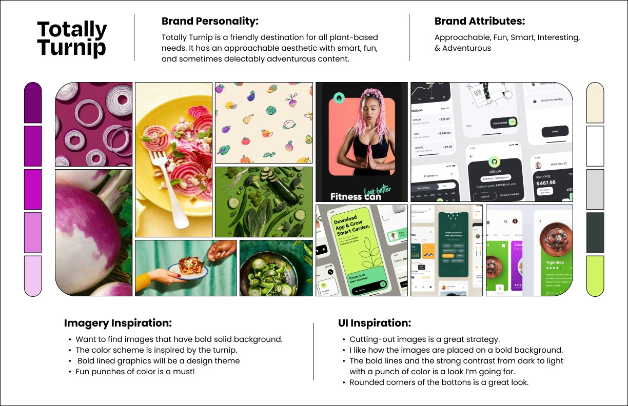
Brand Platform & Mood Board
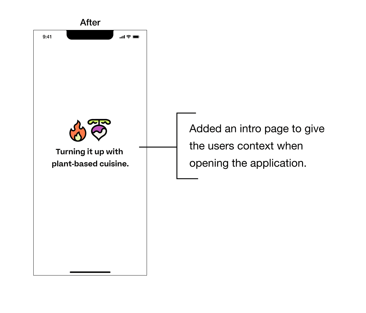
The Brand’s mission, vision, personality, and attributes propelled what needs to be achieved on Mood Board. This product is for a range of people. For someone new to plant-based eating, they might feel a little unsure and perhaps a bit insecure. The approachable and fun esthetic will put them at ease when using the application. We want the content to be smart, interesting, and adventurous to engage more seasoned plant-based eaters. Here I realized there needed to be a colorful and inviting app with a Neo-Brutalist twist to appeal to the modern audience.
Style Guide
The style guide really helped hone in on what elemental icons, buttons, colors, fonts, and overarching friendly modern appeal of the application. I went with greens and purples that would go with the turnip theme. Also, pick out playful pastels for inviting implications. I chose bold iconography to balance out the bold graphics in the layout. Then I chose funky fonts such as Degular for the main headers, Beatrice Trial as a legible funky font that looks similar to Helvetica, and for the finer text, I chose Helvetica Neue for complete legibility. All these fonts are very similar but each version had a slightly different twist that complimented my aesthetic goals and elevated the look. Then the final touch is the logo which was designed from scratch in a classic bold line look. It was intentionally designed in the shape of a ’T’.

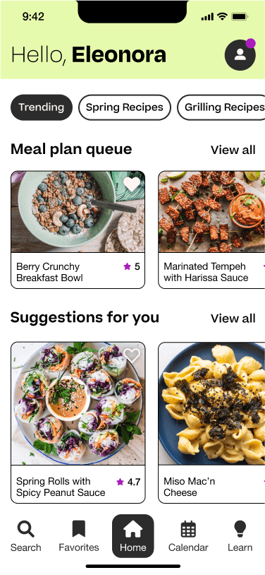
Hi-Fidelity UI’s
The above images are some of the Hi-Fidelity images that were created. Assembling high fidelities allowed me to flesh out what the potential design will look like while also making the prototype ready for testing. This allowed me to see what is working and what is not working in the layout as well as what was and wasn’t working with the functionality of the application.
Slideshow of UI's:


Initial Prototype
Created a prototype in Figma so the product can be tested on real users before the application is fully developed. This also allows me to see any kinks that might be in the user flow and to see if everything is making sense before there is user testing.
4
Test
Usability Testing
Objectives: The Totally Turnip app helps users on their plant-based journey by providing recipes and more in-depth information on nutrition. A prototype was created to better understand the overall usability and 3 main flows that are fleshed out at this point:
1. Look up a recipe.
2. Add a recipe to the meal plan.
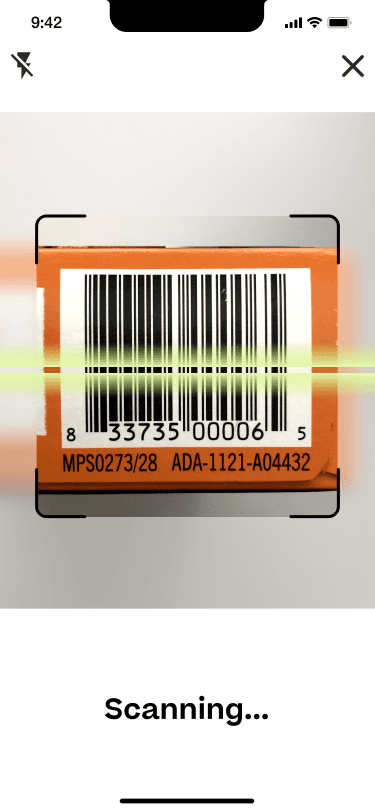
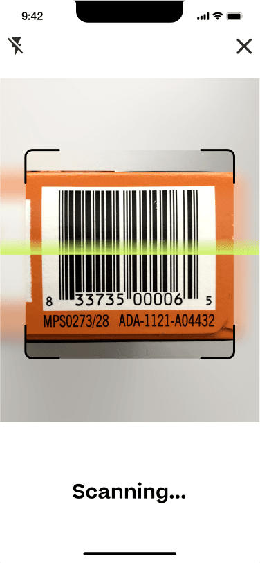
3. Look up product information via barcode.
There will be in-person moderated user testing on 5 participants. The results of the testing will be implemented in improving the application’s usability.
Tasks: The objective of the usability testing is to reveal areas that have usability issues. We want to find issues so we can smooth out the usability experience, build a better application, and find other areas of opportunity.
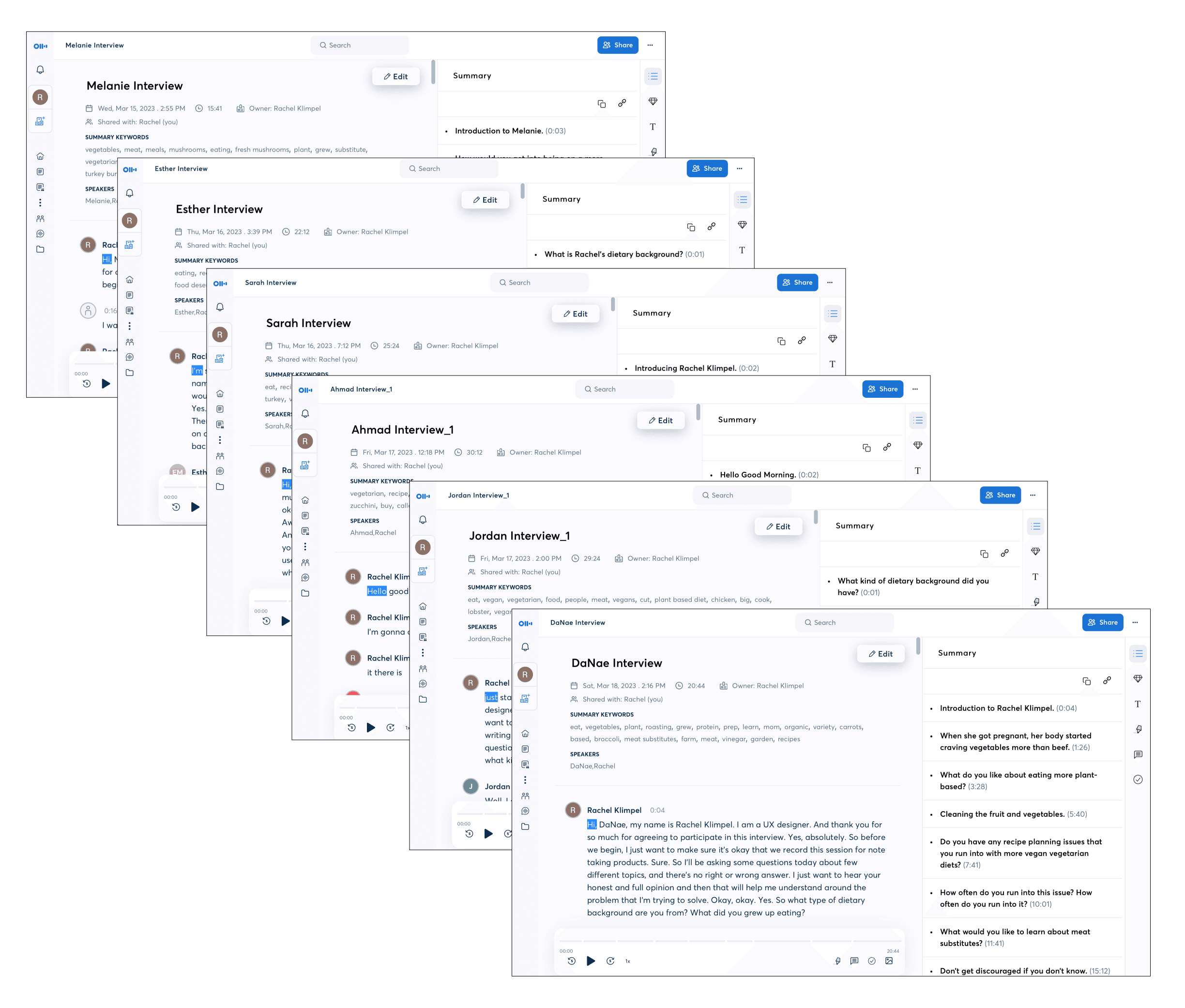
Methods: Selected participants will take part in in-person moderated usability testing sessions. A laptop will be provided to participants and the session will be recorded and transposed by Otter.ia application. All of the tests will be guided, observed, and documented by Rachel Klimpel.

Findings:
Usability Issues by Priority
All usability findings were extracted and organized by Critical, Major, Minor, and Normal on a spreadsheet. This technique helps with seeing an overview of what issues users were experiencing, arranging the level of urgency the input is at, and making an actionable plan to fix the problems.
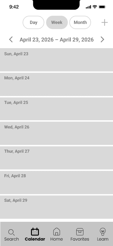
Issue #1
Task 2: Users had a hard time finding where the meal planner option was.
Summary:
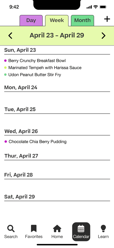
When the user was starting from the home screen, they had a hard time figuring out where the meal planner was. They were clicking on the Meal Planner Queue, but that wasn’t working. And the Meal Planner on the navigation bar states calendar and not Meal Plan. This isn’t user-friendly.
Recommendations:
Change the navigation bar text from ‘Calendar' to ‘Meal Planner'.
Add a link from the Meal Plan Queue to the Meal Planner page.
Make the meal plan queue more noticeable.


Issue #2
Task 2: All 5 users in the test had trouble finding the 'add' option to add a recipe to the meal plan.
Summary:
Once the user was in the Meal Plan section, they had a hard time finding the 'add' option to add a recipe to the meal plan. Once users were in the meal plan, they wanted to go to the calendar day and add it from there. In general, all 5 users initially had a hard time finding where the add button was.
Recommendations:
Would add an add button to each section of the day.
Would make the add button more prominent on the meal plan page.
Would make the add button have color so it sticks out.
Issue #3
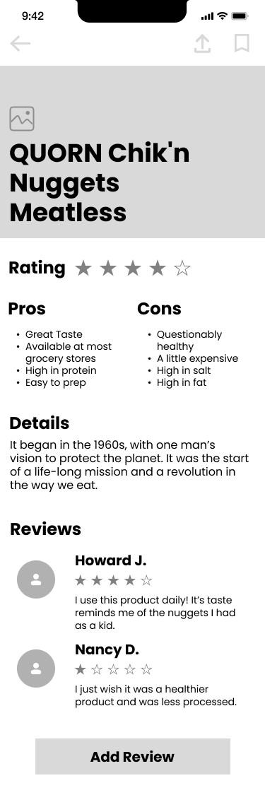
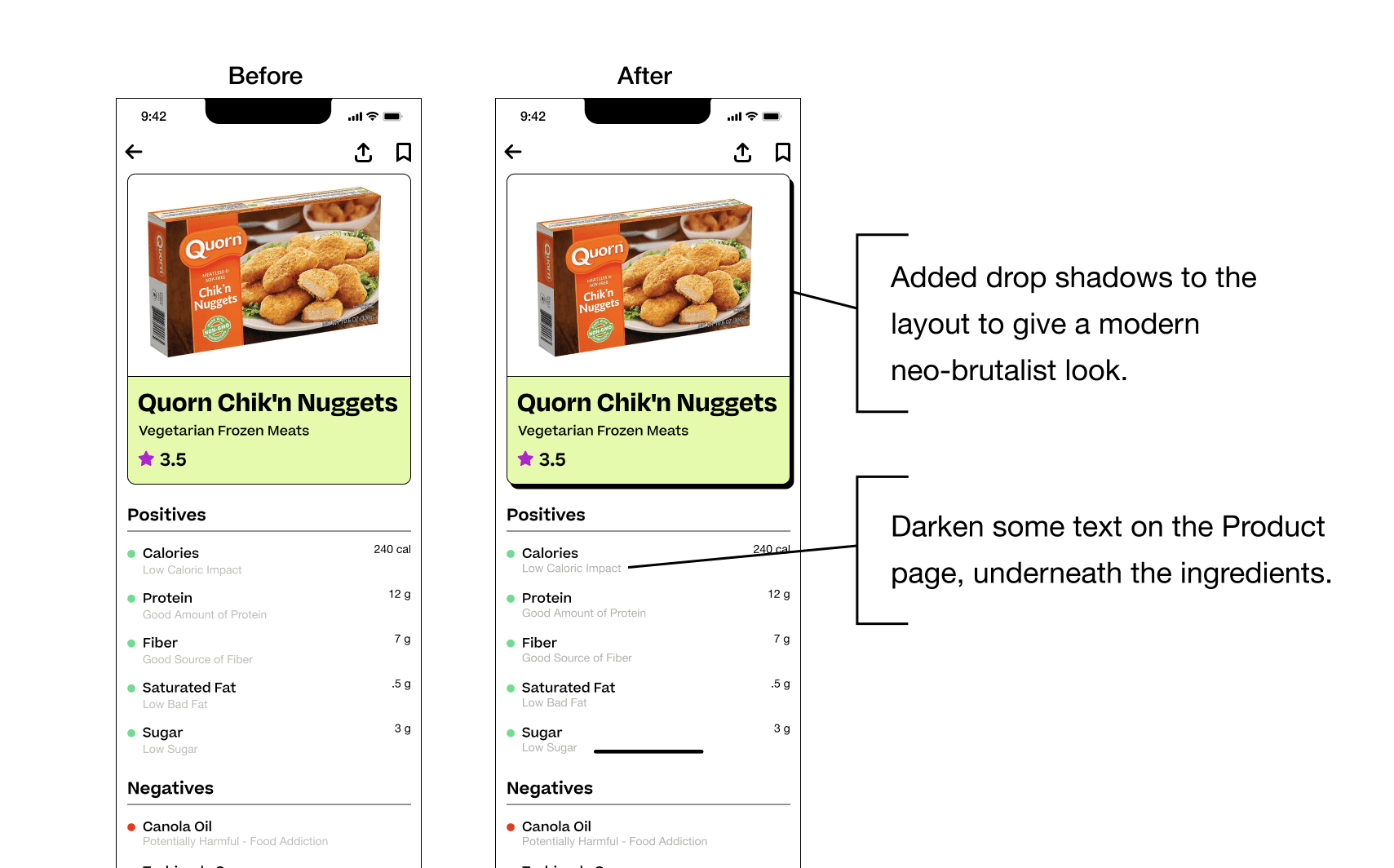
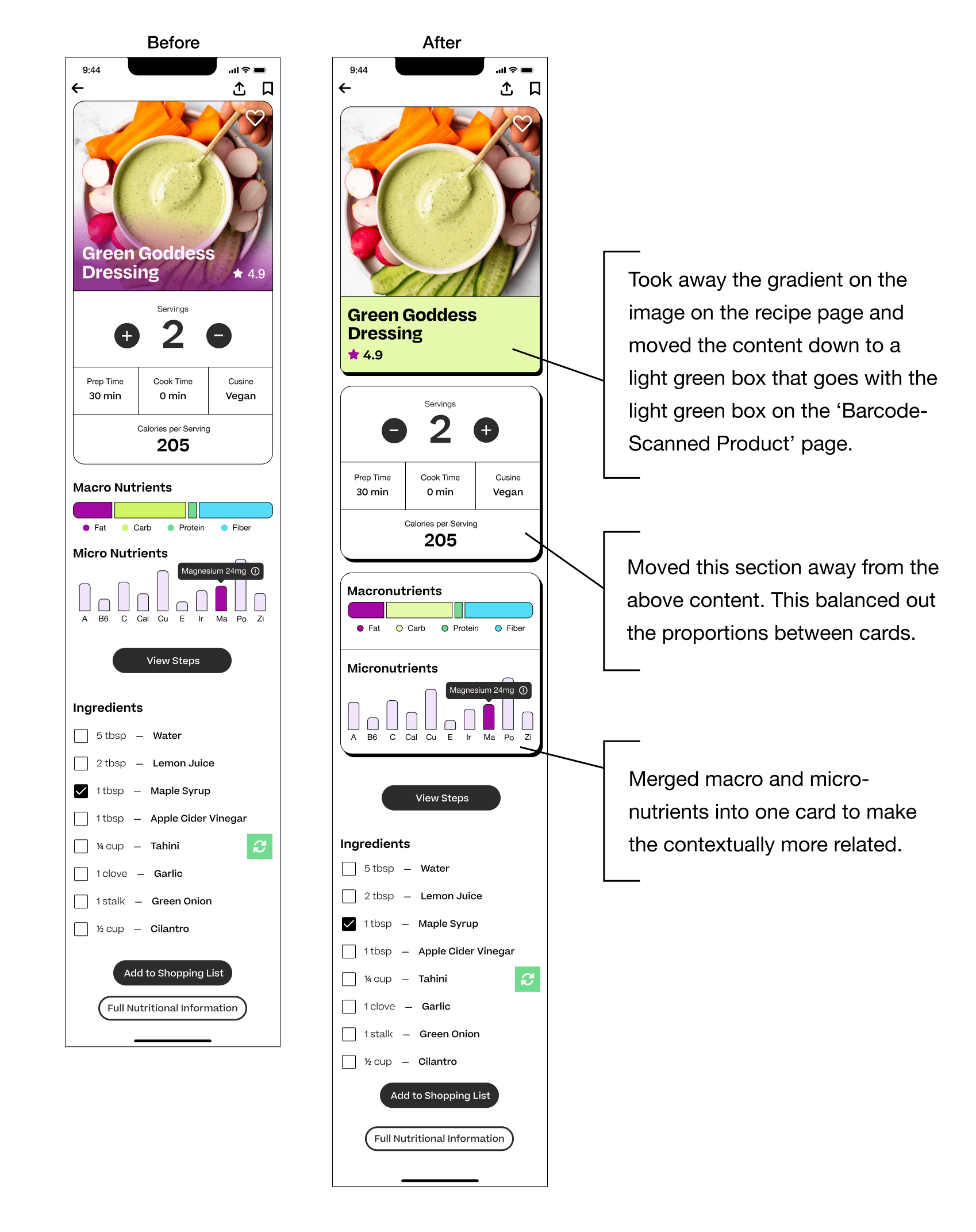
Task 3 - One user didn’t notice the text underneath the ingredients. It was too light and hard to read.
Summary:
There was one user that didn’t notice the text underneath the ingredients. He had issues seeing it. He wondered what was the point of listing off the ingredients when they were listed on the box but then he had a closer look and said the text was faint for him to see.
Recommendations:
Would recommend double-checking with AA and AAA.
Would make the gray a slightly darker shade.
Make sure the ratio of white spacing balances and emphasizes the text.
Other Findings


Final Prototype

5
Reflection
Some key takeaways from this project: The more unbiased information you gather from your testing the better results you will receive. Some of my favorite moments were watching the users testing, or asking what was on their minds in the initial interviews. Another key takeaway is that a honed-in color scheme can unify the design.
What I would do differently in the future is I would add more interactive elements to the micronutrition element on the recipe page and I would create a more explorative filter in the search section where there will be options to explore other cultures and customize for different dietary needs.
The experience that I brought to the table on this project is my research and graphic design background.